A kitchen‑appliance marketplace designed to hold up as it grows — more products, more categories, more sellers, without a redesign.
Dalika is an online store for large kitchen appliances — sinks, faucets, cooktops, and range hoods. It was built for a real client, not a concept exercise, which meant every design decision had to answer to an actual catalog, an actual sales team, and an actual growth plan.
The brief was explicit about one thing above all: the store had to scale. New products, new categories, and new sellers needed to slot in later without tearing up the structure underneath. I owned the design end to end — research, information architecture, UI, and interactive prototypes — working from that constraint outward.
Before drawing anything, I audited three established platforms — Amazon, Alibaba, and Digikala — for how each handled navigation, filtering, product pages, and seller architecture. None of them fit Dalika’s context exactly, but each clarified a different piece of the puzzle.
The research pointed to one throughline: rigid, one-off page designs are what break first when a catalog grows. So the direction I set was structural before it was visual —
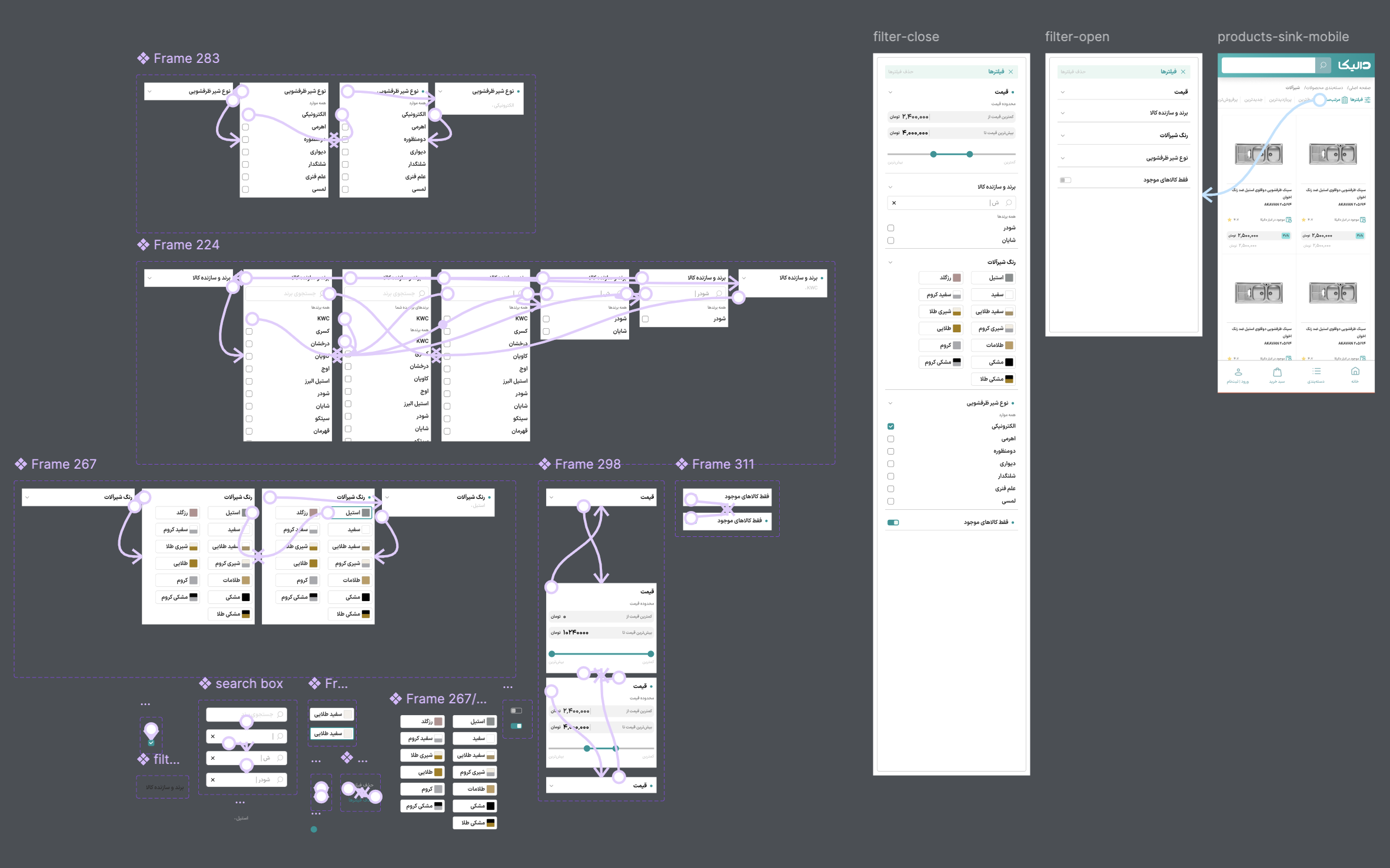
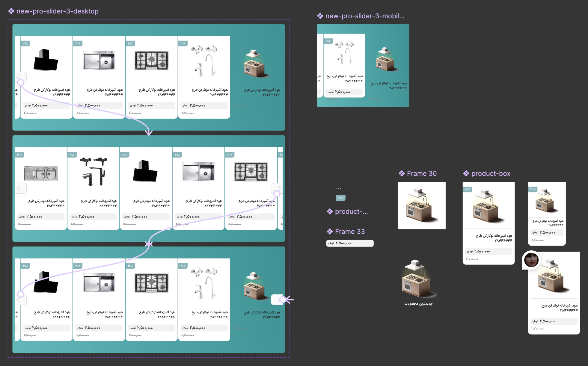
Two components did most of the work of keeping the site flexible: the filter system, which had to handle several independent variables at once (price, brand, color, product type, availability), and the product slider, reused across the homepage, category pages, and promotional banners.


Filtering logic and checkout branching are hard to review as static screens — so I built interactive prototypes for both, mainly to give the client a way to actually click through the logic in review sessions instead of imagining it from a flowchart.
Clickable prototypes turned out to be the fastest way to get real feedback — the client could react to how something worked, not just how it looked.
A large share of Dalika’s traffic came from mobile, so the interface was designed mobile-first and adapted upward rather than the reverse. That meant prioritizing content on small screens, keeping filters and navigation touch-friendly, cutting visual noise on mobile layouts, and making sure no feature was desktop-only.
Homepage, checkout, single product, and category listing — built from the same component set the filter and slider work established, so each page reflects the others rather than feeling designed in isolation.