Classic, balanced, and made to last

Logo Design

Logo design is where every brand story begins. Here is a selection of identities I designed for companies across different industries, from home appliances and furniture to woodcraft and trade. Each mark was built to reflect the company’s character, and each one works as a complete system.
Overview

My Approach to Logo Design

I am always committed to classic principles in logo design, because I believe they never get old and never look cheap. Trends come and go, but balance, simple geometry, clear proportions, and careful typography stay strong for decades. Every logo here starts with the story and character of the brand, then becomes a simple, confident mark that works at any size, in any color, and on any surface. My goal is not to follow what is popular today, but to create identities that a company can proudly use for many years.
Home Appliance Logo Design

Rahmani – Home Appliances

Rahmani is a home appliance importing company. The mark merges a house roof and appliance shapes into a single square, built from clean geometric lines. The dark gray conveys reliability, and the fresh green adds a friendly, modern touch.
Rahmani home appliances logo design, a green and gray square mark combining a house roof and appliance shapes
Furniture & Interior Logo Design

Galstian – Furniture & Interior Design

Galstian has been in the furniture business since 1917. The monogram “G” has strong, angled cuts that suggest craftsmanship and structure. The deep navy and the line “Contemporary Art of Living” connect a century of heritage with a modern look.
Galstian furniture and interior design logo, a navy blue monogram G with the line Contemporary Art of Living
B2B Company Logo Design

str-co – Sana Tejarat Rashin

The str-co mark is a labyrinth. Its path is open and easy to follow, so anyone can find the way through. This is the promise of Sana Tejarat Rashin: a fast, easy, and trustworthy route between business partners. The teal color adds calm and confidence.
str-co Sana Tejarat Rashin logo design, a teal interlocking line mark for a B2B trading company
Woodcraft Brand Logo Design

Sarkhoshian – Woodcraft Industry, Tehran 1965

Sarkhoshian makes billiard tables, and the mark is a monogram “S” inside a shield. Its flowing curves and copper-and-brown palette recall wood grain and the warm look of a billiard room. The classic serif typography adds the weight of a brand founded in 1965.
Sarkhoshian Woodcraft Industry logo design, a brown and copper monogram S inside a shield, Tehran 1965
Tobacco Company Logo Design

Ava Gostar Ashkanian

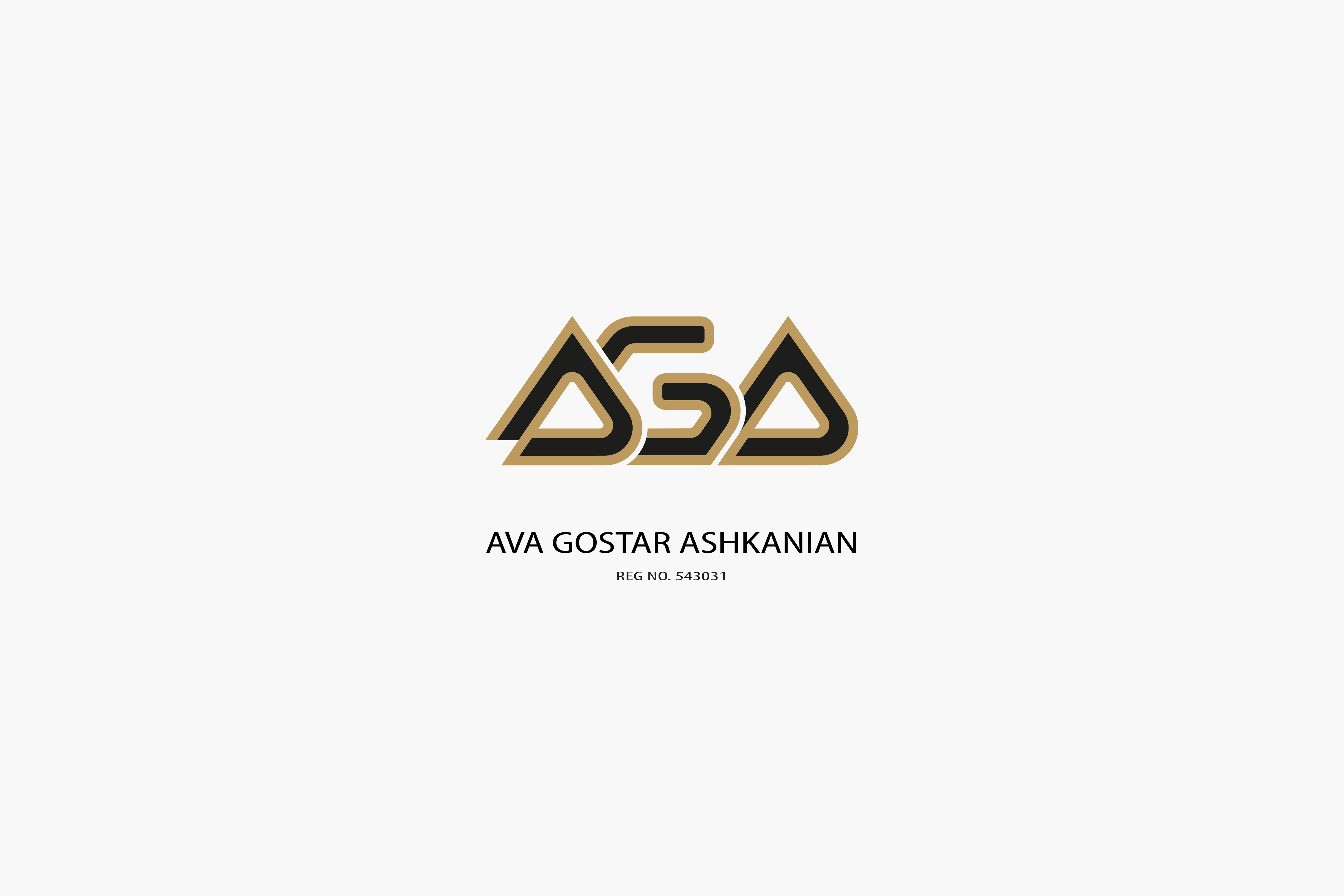
This tobacco company’s identity uses a bold, interlocking monogram with gold outlines on black. The triangular forms give it strength and a sense of premium quality. The registration number adds a formal, official finish.
Ava Gostar Ashkanian logo design, a gold and black interlocking monogram mark

Note: This project has been delivered to the client. The designs shown in the images and videos represent the version I designed and delivered. The live version may have been updated or modified after handover.

View more of my work on the Portfolio page

Like what you see?

Let's talk about your next project.

Whether it’s a full product design, a website rebuild, or turning a static catalog into something interactive — I’d like to hear about it.