UI/UX Design & Elementor Development

FFCR

FFCR A Melbourne fencing and gate supplier’s website, redesigned to feel as sturdy and straightforward as the products it sells.
ffcr-UI/UX Design & Elementor Development
Overview

A trade catalog that still had to sell online

FFCR is a Knoxfield-based fencing and gate supplier with over 20 years in the trade, supplying fence panels, gates, steel posts, and automatic gate openers to homeowners, builders, and tradies across Melbourne. I joined the redesign as part of Tiva Digital’s internal web team, focused on UI/UX and front-end structuring in Elementor Pro, alongside a developer who handled the more technical build.

The brief had two audiences pulling in different directions: a homeowner who wants to browse and buy a fence panel online like any e-commerce product, and a tradie or builder who just wants to find the right spec fast. The site had to serve both without feeling like either a generic webshop or a plain trade catalog.

Role: UI/UX Design & Elementor Dev

Team: Tiva Digital

Location: Australia · Remote

Platform: Web · WordPress/Elementor

Focus

Where I spent most of my time

● UI/UX design improvements across the product overview, category, and single product pages.

● Responsive page design built in Elementor Pro, tested across desktop, tablet, and mobile breakpoints.

● Visual consistency and user experience optimization across six distinct product categories with very different content depth.

● Front-end page structuring and content presentation — turning spec-heavy trade content into something scannable at a glance.

I worked alongside another developer on the team who handled the more technical implementation — the shop/cart functionality and backend configuration — while I focused on the design and front-end structuring side of the build.
01 — Product catalog

Six categories, one consistent entry point

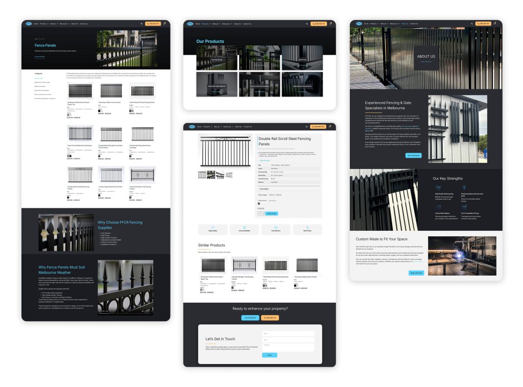
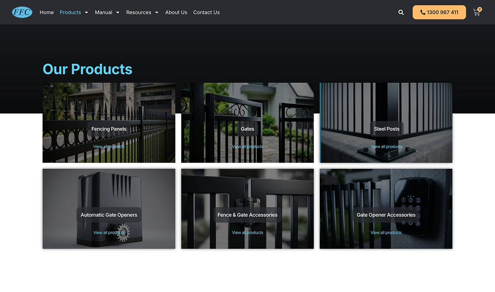
FFCR’s range spans fencing panels, gates, steel posts, automatic openers, and two tiers of accessories. Rather than bury that behind a text menu, the Products page uses large photographic tiles so a visitor recognizes what they need at a glance — closer to how they’d browse the physical showroom than a typical parts catalog.
ffcr-categories-page
02 — Single product page

Enough spec for a tradie, enough clarity for a homeowner

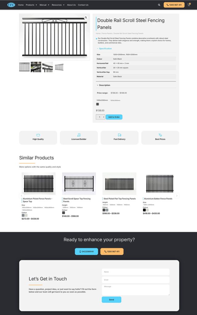
Each product page carries a full specification table — size, colour, rail dimensions, material — alongside a plain-language description, trust badges (High Quality, Licensed Builder, Fast Delivery, Best Prices), and a Similar Products carousel so browsing doesn’t dead-end at one item.
ffcr-Single product page
03 — About & trust

Twenty years in the trade, shown rather than stated

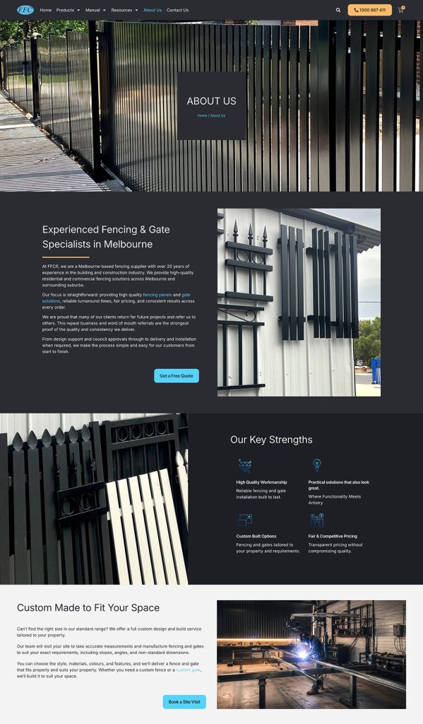
The About page carries the credibility work — experience, key strengths, and the custom-build service for anything outside the standard size range — paired with real workshop and installation photography rather than stock imagery, so the trust claims have something concrete behind them.

FFCR About Us page with company introduction, key strengths, and custom fencing service

ffcr-About & trust-page

Note: This project has been delivered to the client. The designs shown in the images and videos represent the version I designed and delivered. The live version may have been updated or modified after handover.

View more of my work on the Portfolio page

Like what you see?

Let's talk about your next project.

Whether it’s a full product design, a website rebuild, or turning a static catalog into something interactive — I’d like to hear about it.