Avisa is a manufacturing factory specializing in building faucets and sanitary fittings. The goal of this project was not to create an e‑commerce platform, but to design a product‑focused corporate website that clearly presents each product, strengthens brand credibility, and supports future growth.
Role: Product Designer (UI/UX)
Scope: End‑to‑End Design & Implementation
Platform: Web (Responsive)
Tools: Figma, WordPress, Elementor Pro
آویسا یک کارخانه تولید شیرآلات و تجهیزات بهداشتی ساختمانی است. هدف این پروژه طراحی یک وبسایت فروشگاهی نبود، بلکه ایجاد یک وبسایت شرکتی و محصولمحور بود که بتواند محصولات را بهصورت شفاف، حرفهای و قابل توسعه معرفی کند و در عین حال اعتماد مخاطبان تخصصی را جلب نماید.
نقش من: Product Designer (UI/UX)
دامنه پروژه: طراحی و پیادهسازی End‑to‑End
پلتفرم: وبسایت ریسپانسیو
ابزارها: Figma، WordPress، Elementor Pro
Avisa needed a website that could professionally introduce its products without displaying prices or enabling online sales. Each product required a dedicated single product page focused on clarity, specifications, and visual detail.
Challenges included:
نیاز اصلی آویسا، معرفی دقیق محصولات بدون نمایش قیمت و بدون فروش آنلاین بود. هر محصول باید صفحهی اختصاصی خود را میداشت؛ صفحهای که تمرکزش بر توضیح، نمایش جزئیات و ایجاد درک درست از کیفیت محصول باشد.
چالشهای پروژه:
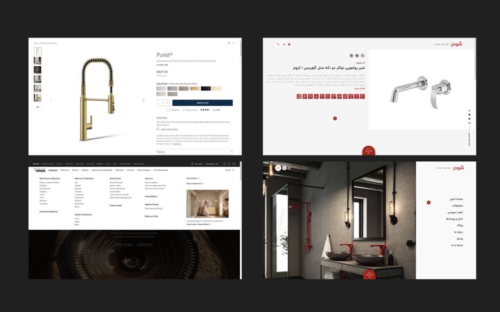
The client initially referenced Iranian competitors such as Shouder. While visually appealing, these websites revealed major usability issues:
For an industrial and professional product, these interactions proved distracting for serious users who want to search, compare, and evaluate products efficiently.
To redefine the benchmark, I analyzed multiple international brands and ultimately focused on Kohler. Kohler’s website demonstrated:
Despite lacking similar lifestyle photography resources, I extracted the core structural and UX principles behind Kohler’s product presentation.
در ابتدا، سایتهای ایرانی فعال در این حوزه (مانند شودر) بررسی شدند. با وجود ظاهر نسبتاً جذاب، چند مشکل اساسی در این سایتها دیده میشد:
برای محصولی صنعتی، چنین رویکردی باعث ایجاد حواسپرتی میشود—بهخصوص برای کاربرانی که با هدف جدیِ مقایسه و بررسی محصول وارد سایت میشوند.
در نهایت، سایتهای خارجی بررسی شدند و Kohler بهعنوان مرجع اصلی انتخاب شد.
سایت کهلر دارای ویژگیهایی بود مانند:
با وجود تفاوت زیاد در منابع تصویری، تمرکز من روی استخراج منطق طراحی و استراتژی تجربه کاربری کهلر بود، نه تقلید ظاهری.
Instead of imitating visuals, I focused on translating strategy:
The entire website was designed with minimalism and scalability in mind, ensuring future content expansion without redesign.
بهجای تمرکز صرف بر جلوههای بصری، مسیر طراحی بر پایه تصمیمهای محصولی شکل گرفت:
کل سایت بهگونهای طراحی شد که مقیاسپذیر باشد و در آینده بدون نیاز به بازطراحی اساسی توسعه پیدا کند.
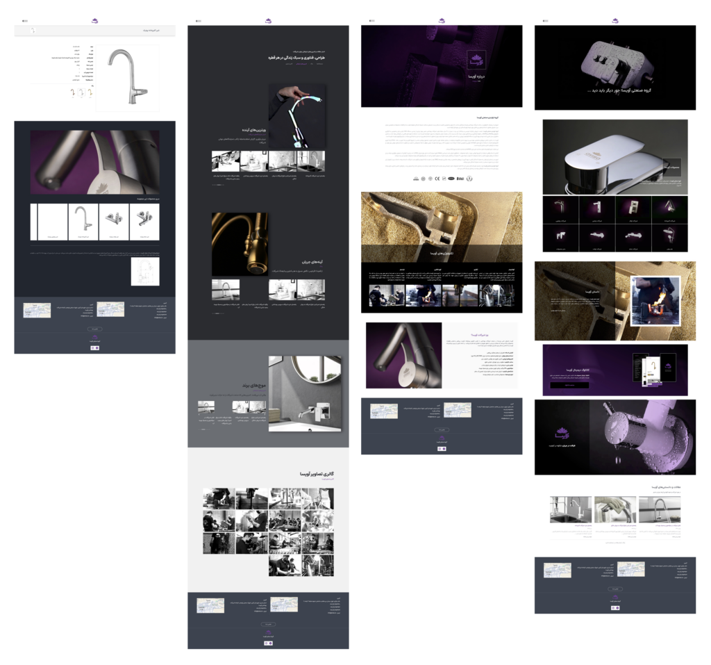
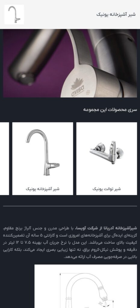
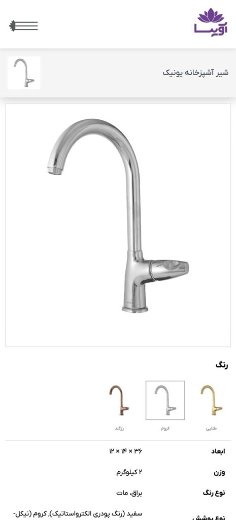
Each product page was designed as a single‑product experience, inspired by international standards:
Within the technical limits of Elementor, the product pages were designed to get as close as possible to premium international benchmarks.
هر محصول بهصورت یک Single Product Page مستقل طراحی شد:
با توجه به محدودیتهای فنی المنتور، تلاش شد طراحی صفحات تا حد ممکن به استانداردهای بینالمللی نزدیک شود.
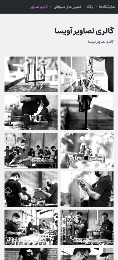
Rather than a simple blog, a content hub was designed with multiple sections:
This structure allows Avisa to publish diverse content types over time while keeping the experience engaging—especially for professional audiences seeking industry updates.
The gallery also functions as a moment of visual relief and additional trust signal.
بخش بلاگ صرفاً یک وبلاگ ساده نیست، بلکه بهعنوان یک Content Hub طراحی شد با بخشهای مجزا:
این ساختار به آویسا اجازه میدهد در آینده محتوای متنوع منتشر کند و برای مخاطبان تخصصی ارزش محتوایی واقعی ایجاد شود.
بخش گالری نیز علاوه بر اعتمادسازی، نقش یک استراحت بصری برای کاربر را دارد.
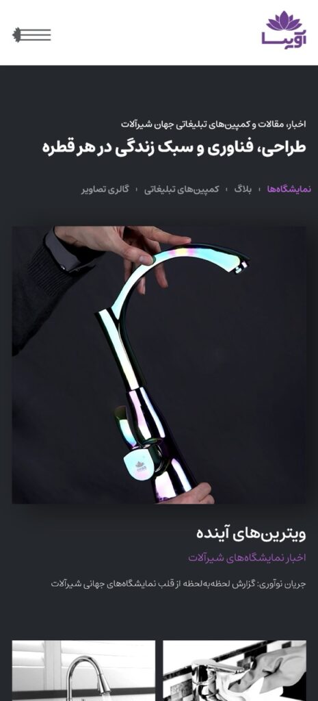
A minimalist navigation system was designed with:
The menu balances elegance with efficiency, avoiding unnecessary animation that could interrupt focused browsing.
منوی سایت با رویکردی مینیمال طراحی شد:
هدف از طراحی منو، تعادل بین زیبایی و کارایی بوده است.
Mobile responsiveness was a core priority throughout the project.
Each page was considered complete only after the mobile version was fully refined, clear, and intuitive.
The layout was designed mobile‑first and then adapted to larger screens, ensuring:
ریسپانسیو بودن سایت یکی از مهمترین اولویتهای پروژه بود.
هیچ صفحهای نهایی تلقی نمیشد مگر اینکه نسخه موبایل آن کاملاً شفاف، بدون نقص و قابل فهم باشد.
طراحی با رویکرد Mobile‑First انجام شد و سپس برای دسکتاپ توسعه پیدا کرد تا:
The final result is a clean, professional, and future‑ready product website that:
خروجی این پروژه یک وبسایت شیک، رسمی و قابل توسعه است که: