Catalogs, company profiles, and stationery with accurate color and size
Designed for Offset Print
Every project here was prepared for offset printing, from color separation and spot colors to die-cuts, foil, and binding. The goal is simple: the printed piece looks exactly as it was designed.
Overview
Rules First, Beauty Second
I never sacrifice the rules for visual beauty. In print, breaking conventions does not always give the result you want, and quality comes first. That is why I made it a priority to master the technical essentials of offset printing: overprint and knockout settings, trim marks, bleed and safe margins, contrast and tonal range, Pantone spot colors, grid and layout, and how coated and uncoated paper change the look of color. I follow these standards in every project, so the printed piece matches the design.
My designs are minimalist and modern, but they stand on classical principles: balance, hierarchy, clear proportions, and careful typography. This is the same approach I use in my logo work, because both rely on the same belief: classic principles never look old or cheap. The result is offset print design that looks refined on screen and prints exactly as planned.
A watch catalogue prepared for digital and offset printing
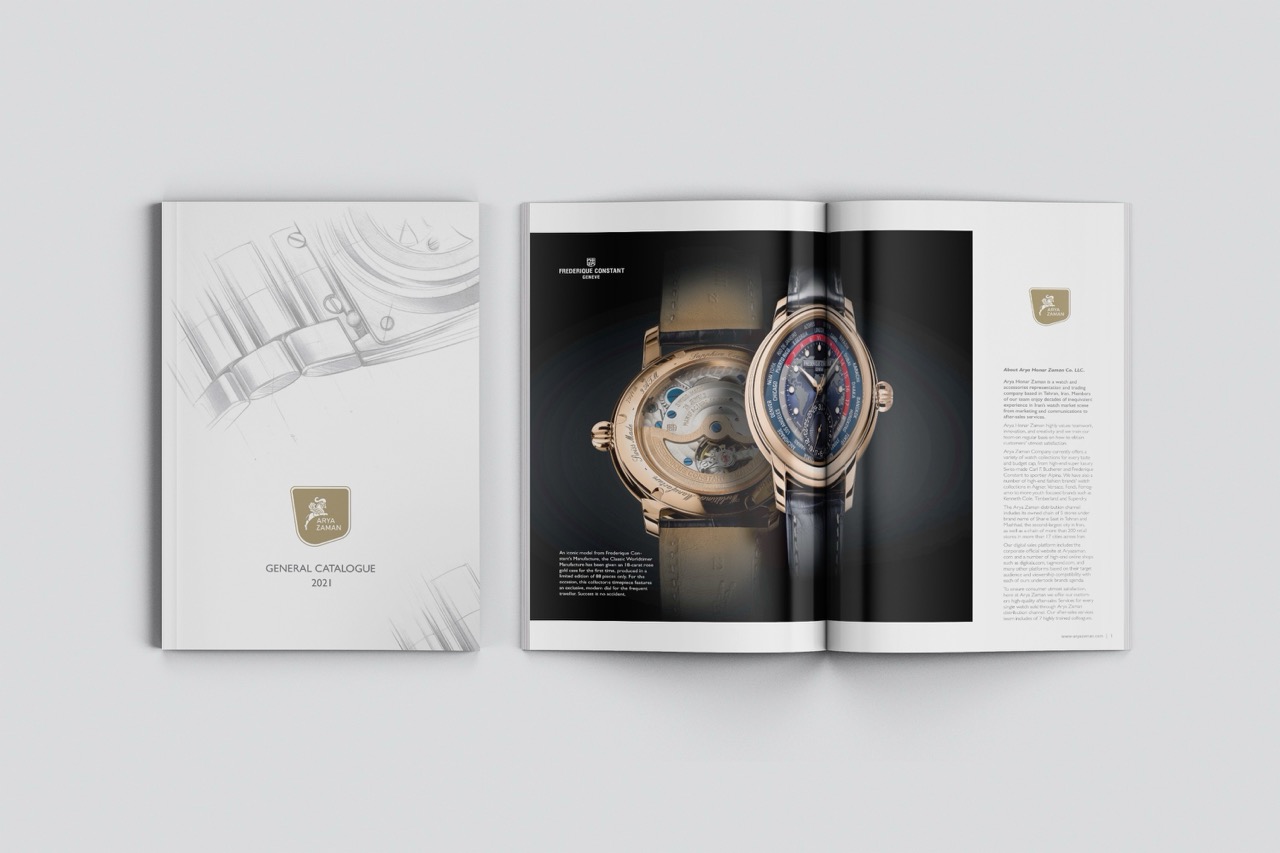
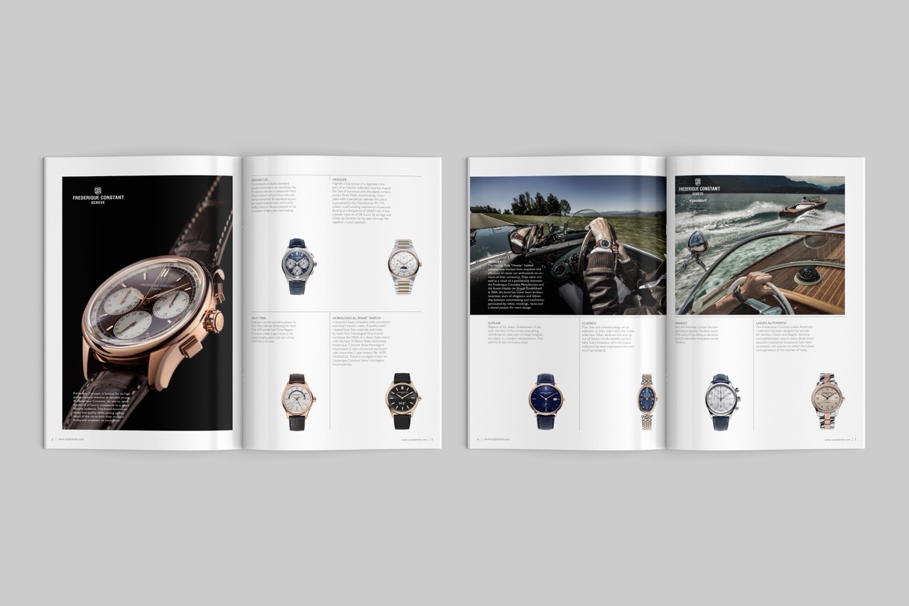
Arya Zaman General Catalogue 2021
A catalogue for a wristwatch importing company and the exclusive distributor of Frédérique Constant watches. The layout is clean and spacious, with large product photography and a consistent grid, so each watch stays the focus. It was designed for digital printing, and the files were also prepared to work for offset printing, so the company can print short or long runs with the same design. The layout was designed in InDesign.
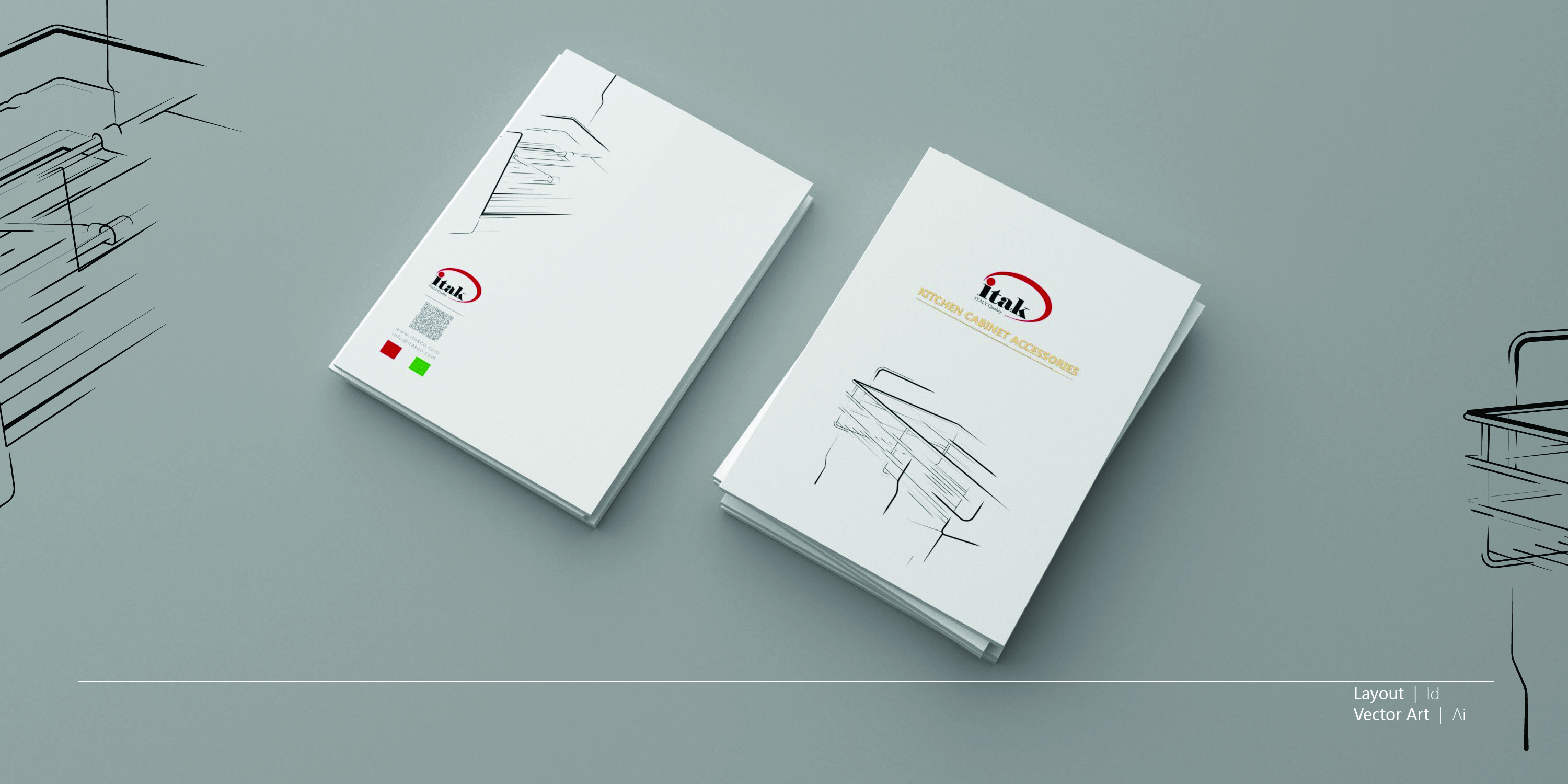
Itak Catalog Cover Design
Gold hot-foil lettering on a clean white cover
A cover design for a kitchen cabinet accessories catalog. The title is printed in gold hot-foil stamping, which adds a quiet premium detail to an otherwise white, minimal cover. The line illustrations of cabinet organizers keep the focus on the products. The layout was designed in InDesign, and the vector illustrations were created in Illustrator.
Offset printing · Gold hot-foil stamping
Layout: InDesign · Vector art: Illustrator
Client: Negaran Printing Company
Five-color offset print with a Pantone silver spot color
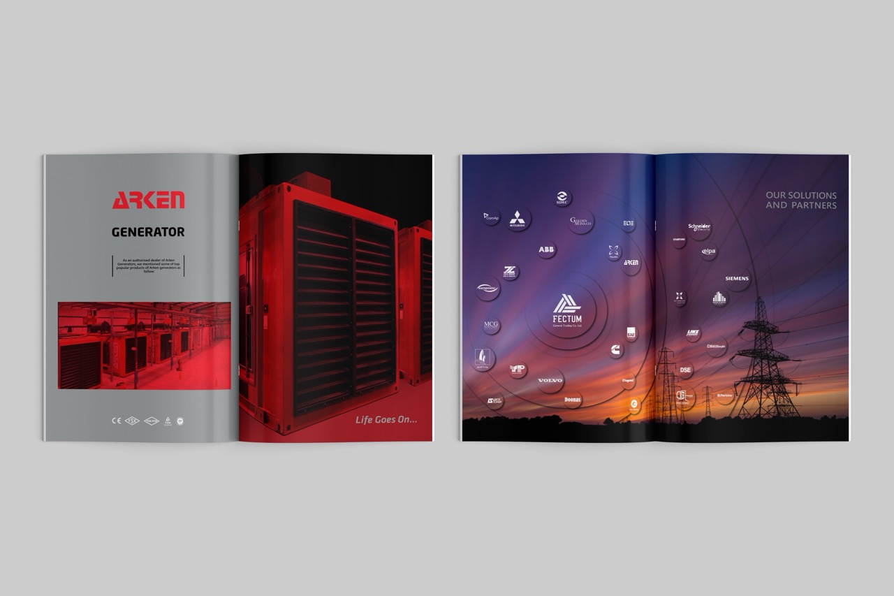
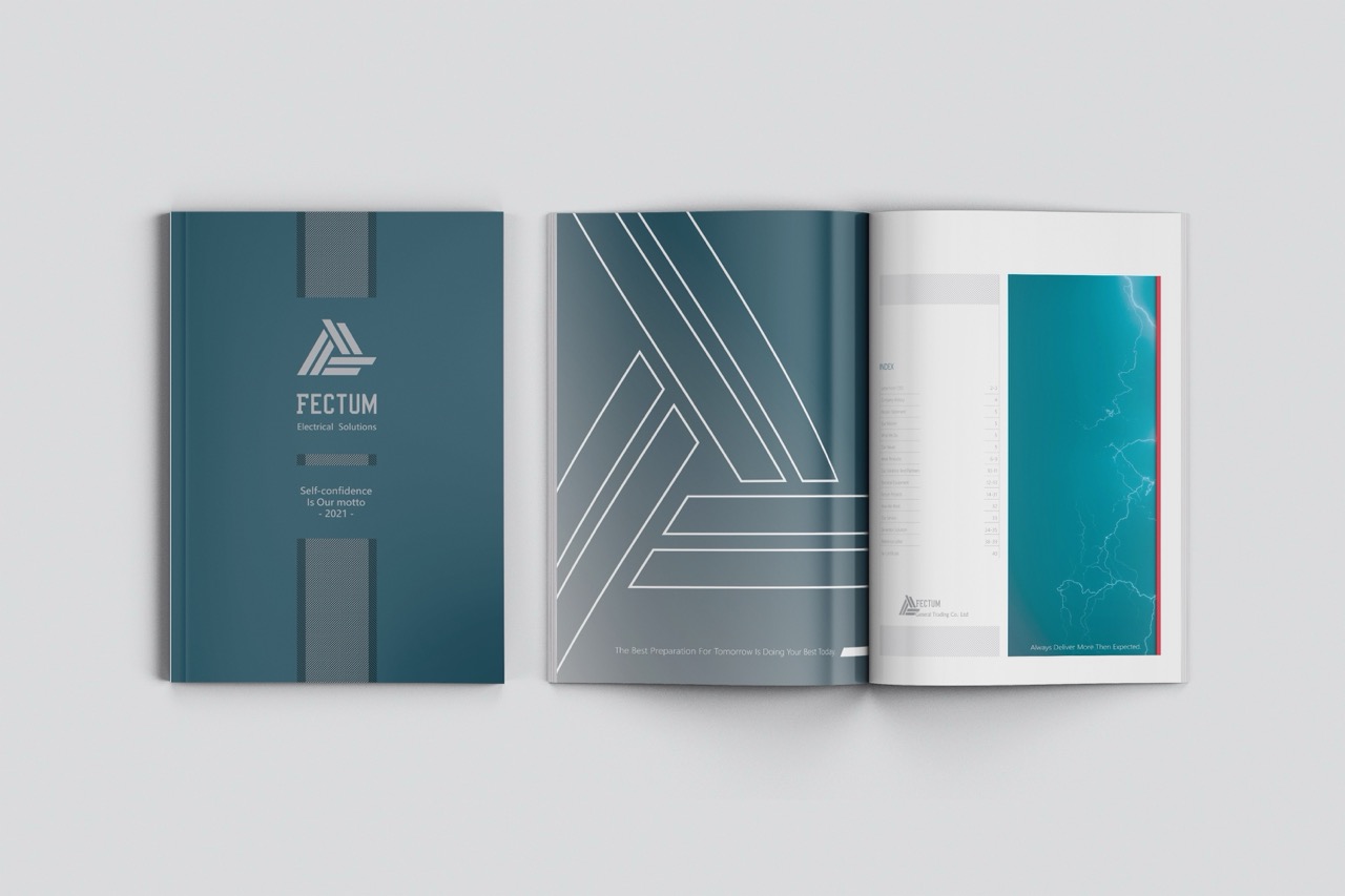
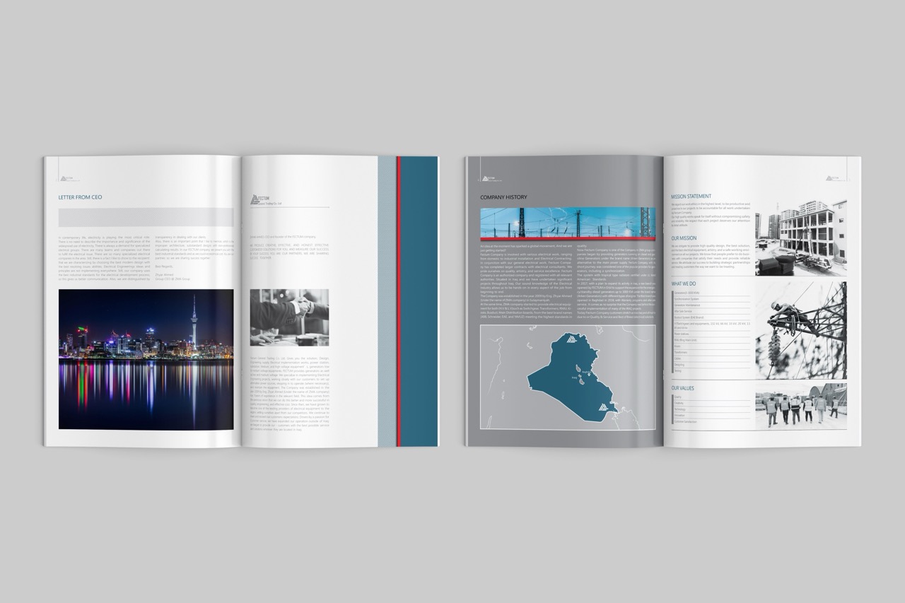
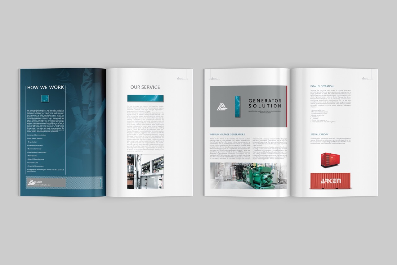
Fectum Company Profile
A company profile for Fectum, an electrical solutions company, printed in five colors: CMYK plus a Pantone metallic silver spot color. The silver gives the teal cover and the logo a cool, technical look that fits the industry. The long, technical content is organized with a clear grid, strong section pages, and a map of the company’s market. The layout was designed in InDesign, and the photos were edited and combined in Photoshop.
Layout: InDesign · Photo editing and photo montage: Photoshop
Client: Negaran Printing Company
Four-color offset catalog with a die-cut cover
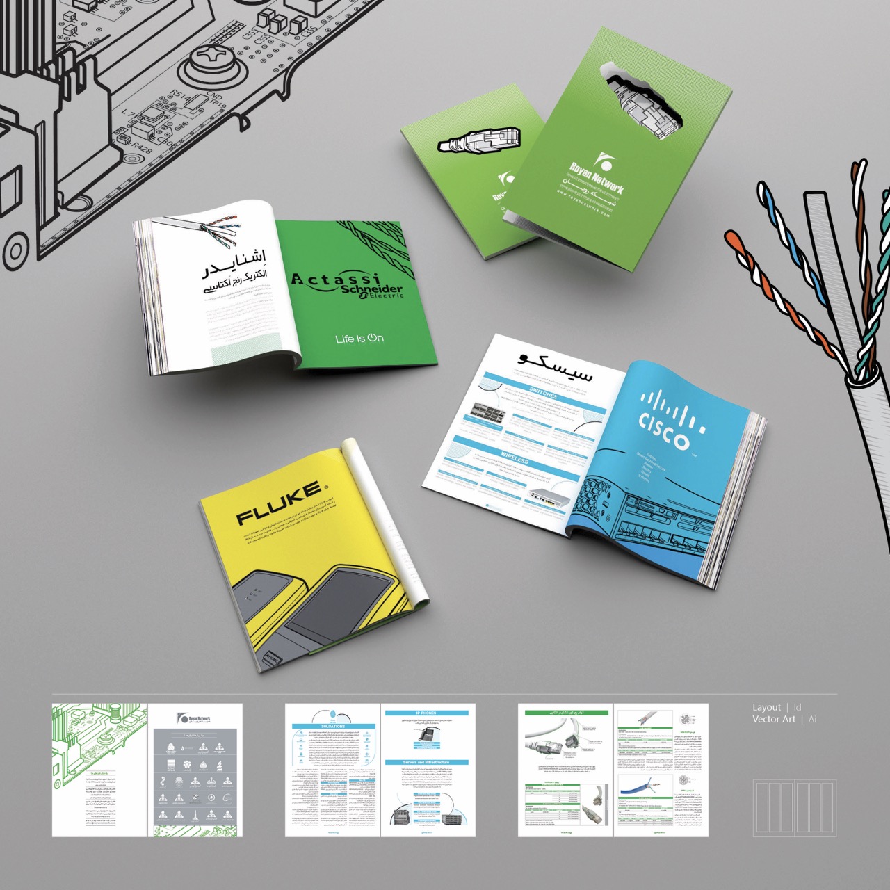
Royan Shabakeh Catalog
A four-color (CMYK) catalog for a network equipment company, printed by offset. The front cover is die-cut in the shape of a network connector, one of the company’s own products, so the cover itself shows what the company sells. The layout was designed in InDesign, and the vector illustrations were drawn in Illustrator.
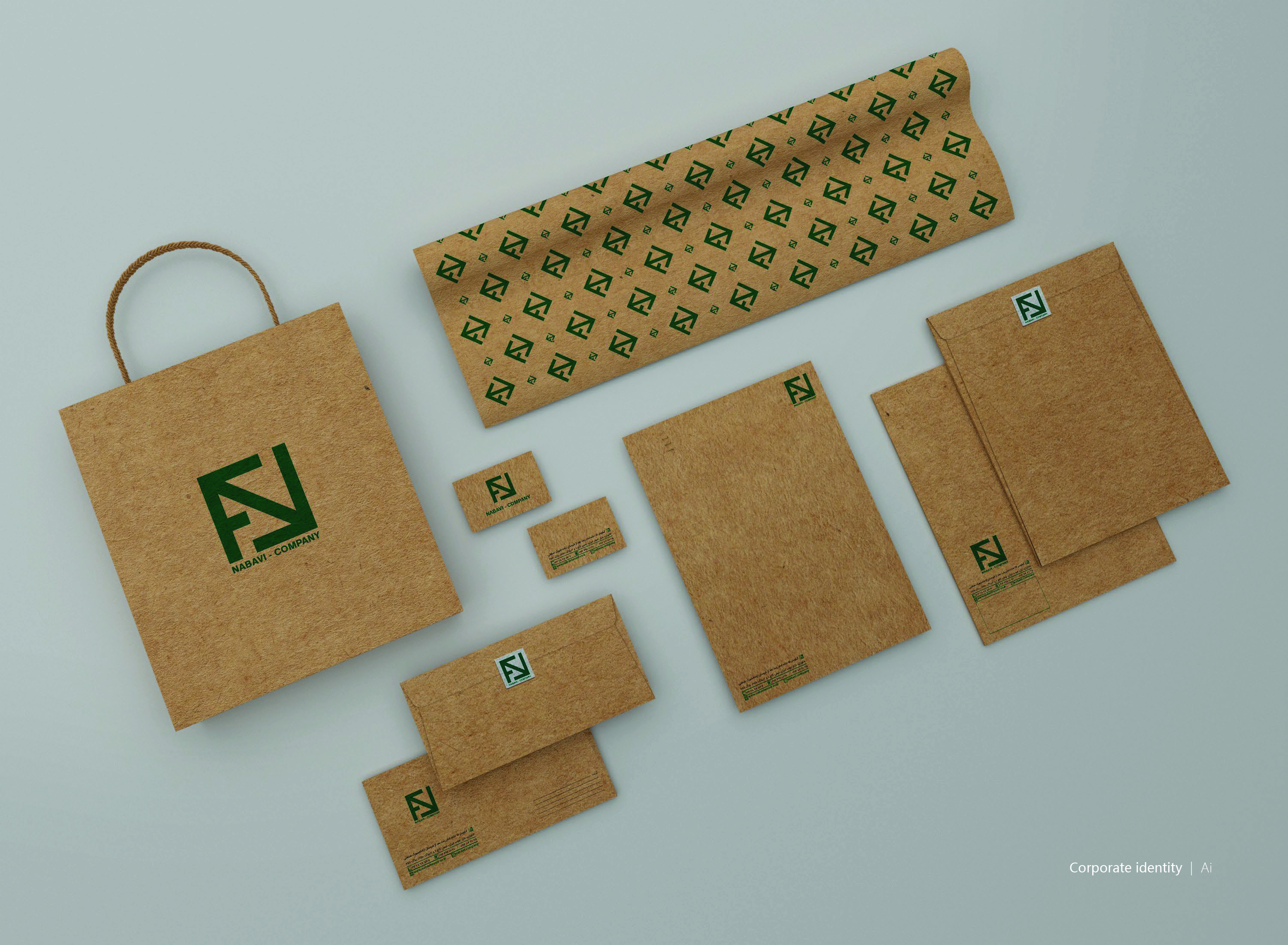
A corporate stationery set for Nabavi Wood Factory, including a gift bag, business cards, letterhead, envelopes, and wrapping paper. Everything is printed in one green ink with a raised print effect on natural kraft paper. The rough paper and a single color fit a wood company well: the identity looks honest, warm, and low-cost to produce. The logo and the repeating pattern were designed in Illustrator.
Offset printing · Single color (green) · Raised printing on kraft paper
Vector art: Illustrator
Client: Negaran Printing Company
Note: This project has been delivered to the client. The designs shown in the images and videos represent the version I designed and delivered. The live version may have been updated or modified after handover.