Elementor UI Design: 5 Proven Improvements for a Cleaner Website
Designed and built the interface directly in Elementor Pro. Created a cleaner visual system, improved product templates, and a more consistent layout across key pages.
Overview
Designing and building the UI in Elementor Pro
I joined the project as UI Designer and Elementor Developer, working alongside a colleague who handled the more technical WordPress side.
Because the UI had not been designed in Figma beforehand, I developed the visual direction and built the pages at the same time directly in Elementor Pro. This Elementor UI Design approach meant translating layout, spacing, colour, typography, and component decisions straight into a working front-end while refining them along the way.
The focus of this Elementor UI Design work was on creating a cleaner, more modern interface that felt consistent across templates and presented product information in a clear, scannable way.
Role: UI Design & Elementor Dev
Team: Tiva Digital
Remote
Duration: Feb 2025 · 1 mo
nfcc. case study
Focus
Where I spent most of my time in Elementor
Complete visual redesign with a more modern and minimal approach
New colour and typography system (green as the accent colour)
Clearer layout and improved consistency across the site
Building and refining the pages in Elementor Pro
Redesigning the single product page with better-organised content and a dedicated section for extended descriptions alongside product images
Creating a flexible structure that can easily adapt to future changes
I focused on the design and front-end structuring side of the build, while another developer on the team handled the more technical implementation.
01 — Home, About, and Contact
Styling & Layout of Core Pages
These three pages received the most detailed styling and layout work in Elementor Pro.
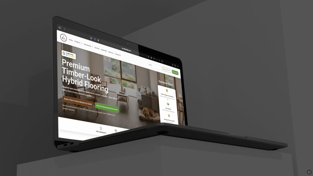
The homepage was built with a clear hero section that places the Google rating up front, followed by cleanly structured product category blocks.
On the contact page, the quote form, showroom hours, and map were arranged side-by-side in a balanced layout so no element feels secondary.
The overall styling focused on consistency, clear visual hierarchy, and a clean structure that works well across different screen sizes.
02 — Making a spec sheet feel like a showroom conversation
Product Page UI & Structure in Elementor
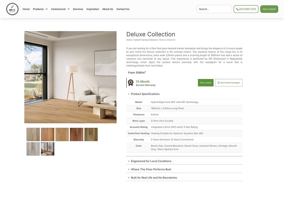
The product page was redesigned with a more modern and balanced structure.
Full technical specifications are organised in a clear, collapsible format so the page never feels like a dense datasheet.
A clean white background lets the predominantly warm brown flooring photos stand out. Titles and body text use black and dark grey for strong hierarchy.
The accent green is used selectively on key buttons, while the overall palette stays in harmony with the site’s brown logo — resulting in a balanced and professional page.
03 — A dedicated landing page for the best-selling category
Hybrid Landing Page Design & Build
The UI for the hybrid landing page was built around a modern layout that combines strong product imagery with a clean structure.
It follows the same white-background system used across the site, but with a higher density of photography.
Green and brown accent elements — used on buttons and selected interface objects — are distributed evenly throughout the page.
This balanced use of colour, paired with the imagery, creates a modern design that remains visually engaging from top to bottom.
If you’d like to discuss a similar project, you can contact me here.
Note: This project has been delivered to the client. The designs shown in the images and videos represent the version I designed and delivered. The live version may have been updated or modified after handover.