Dalika is an e-commerce platform for home appliances, including sinks, faucets, cooktops, and range hoods. Its customers browse large product catalogs, compare options, and need to find the right product quickly.
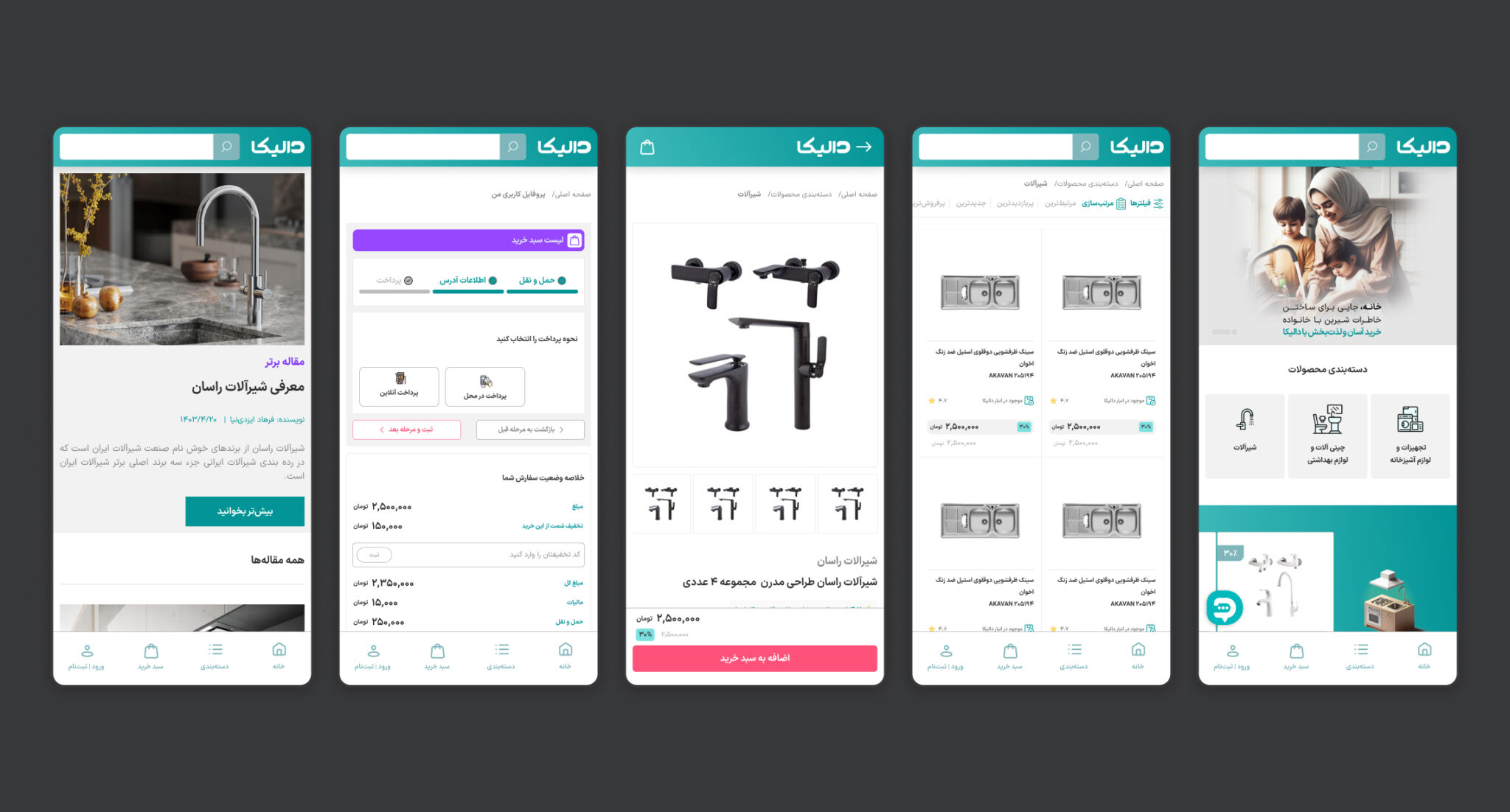
I designed the experience across more than ten pages and the key user flows: homepage, store, product detail, About Us, login, user dashboard, shipping, policies, terms and conditions, and blog. Instead of treating each page as an isolated interface, I built one consistent system that can support a growing catalog while staying simple to navigate.
My scope was design: UX/UI, information architecture, the design system, prototyping, and responsive behavior. Implementation and deployment were handled by the client’s development team. I support the client and developers in briefing sessions whenever they need it, and I have continued to do so long after delivery.
Role: Product Designer
Scope: UX/UI Design · Information Architecture · Design System · Prototyping · Responsive Design
Tools: Figma
Platform: E-commerce · Web
Shoppers rarely visit a home-appliance store to explore the interface. They arrive with a goal: find a product, understand the options, compare alternatives, and decide with confidence. The design had to make that path effortless, even though the catalog behind it was large and growing.
The design needed to:
• Make products easy to scan and compare
• Keep recommendations relevant to the shopper’s original goal
• Support a large, growing catalog with different attributes and content types
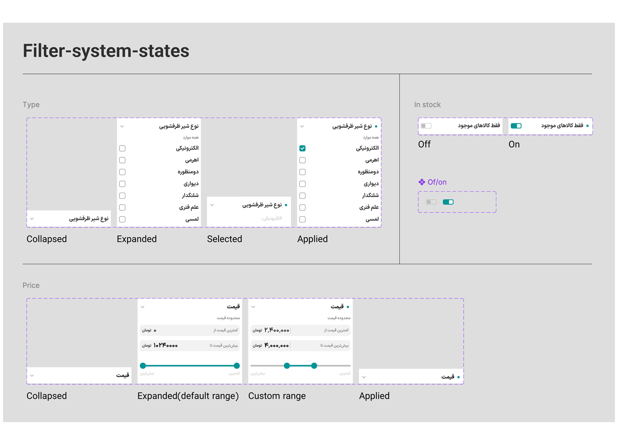
• Make filtering powerful without making it complicated
• Leave room for future features without a redesign
• Stay consistent across more than ten pages and several user flows
The central principle: complexity should live in the system, not in the user’s experience.
I analyzed three major platforms, Digikala, Amazon, and Alibaba, to see how they handle large catalogs, search, filtering, product discovery, and information density. I was looking for patterns that hold up at scale, not styles to copy.
• Simplicity over decoration. Animations and hover effects were minimal, and speed came first. → I kept decorative interaction to a minimum.
• Consistency lowers cognitive load. Colors, typography, and components stayed consistent across internal pages. → I used one palette, one type system, and shared components across every page.
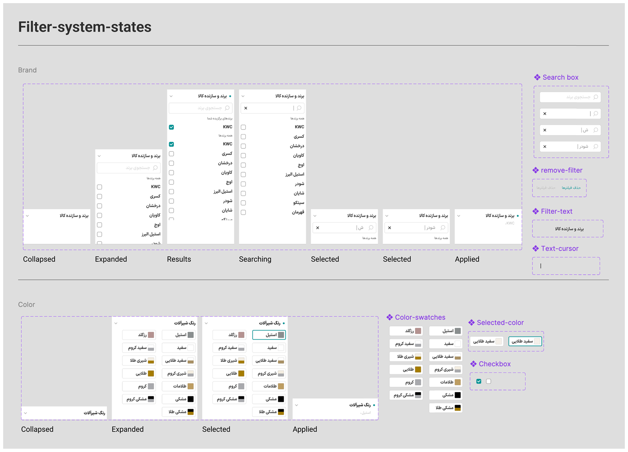
• Filtering is fundamental. In a large catalog it is one of the main ways people navigate. → I designed a dynamic filter system.
• Large catalogs need not feel chaotic. The strongest examples handled huge amounts of information without clutter. → I built a clear hierarchy and clean product presentation.
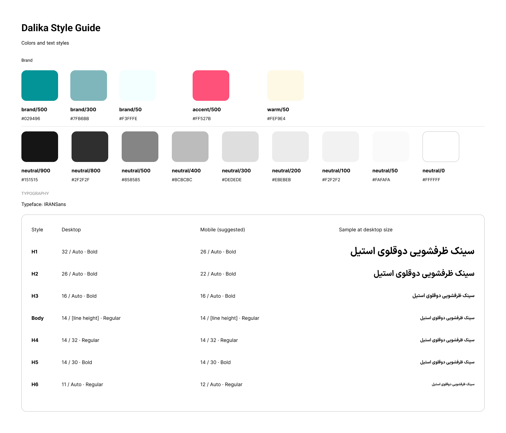
In a product-heavy store, an abundance of colors, typefaces, and effects can look attractive in a mockup, but it raises cognitive load when people are comparing products. I built a minimalist system on a restrained palette, consistent typography, strong hierarchy, clear product presentation, and predictable component behavior.
Surfaces are white and light gray, with green accents taken from the brand identity. For the highlight color I chose a bright pinkish-red. A conventional red reads as an error or warning, so I picked a warmer tone that adds emphasis without signaling failure, contrasts with the brand’s green, and keeps the store feeling inviting.
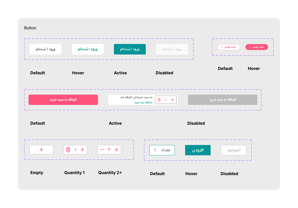
I also prepared a style guide covering the design elements and my own recommendations, with dynamic components that support adding and removing items.
Filtering, checkout, and shipping are hard to review as static screens. Prototyping was part of the workflow across the whole project: I built interactive prototypes so the client could click through the logic in review sessions and react to how something worked, not only how it looked.
• Filtering: selecting, changing, and clearing multiple attributes
• Shipping: the sequence of steps for completing delivery information
• Checkout: a purchase flow where each step stays clear and predictable
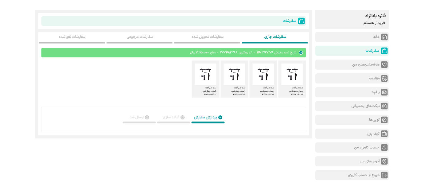
• Account management: the dashboard structure for orders, returns, favorites, and addresses
The interface stays consistent across screen sizes while adapting to the space available. Larger screens can hold more persistent navigation and information. Smaller screens call for stronger hierarchy, touch-friendly controls, and a focus on essential actions. I adapted navigation, product cards, filtering, product information, and primary actions for each context instead of simply scaling the desktop layout down.
The customer dashboard is the one exception. It was designed for desktop only, at the client’s request.
The client and the development team were both satisfied with the result, especially with the balance between a simple user experience and the complexity handled behind the scenes.
The client described the design as simple and minimalist.
The client has continued to use the same design for three years, and is now preparing a second implementation with a new development team, built on the same underlying design concept. I continue to support the client and developers in briefing sessions whenever they need it.
What this project taught me
• Designing for scale means defining rules and relationships. The filters, the dashboard, and the catalog all had to keep working as content grew, which depends on structure more than on individual screens.
• Good ideas have to be buildable. Redesigning a purchased profile section within existing code, time, and budget taught me to design enhancements a team can actually ship.
• Good e-commerce design removes friction. It does so from the interactions that matter most, and leaves everything else out of the way.
The filters can have many states, the dashboard can keep growing, and the catalog can keep expanding. The shopper never has to think about any of it.
Dalika’s design gives our customers a simple, clear experience, while the structure behind it handles the complexity.
— Maryam Saneghi, CEO, Yeganeh Tarrahan Advertising Agency
Note: This project has been delivered to the client. The designs shown in the images and videos represent the version I designed and delivered. The live version may have been updated or modified after handover.
View more of my work on the Portfolio page